When planning for future carpet collections, especially when developing a new color range, inspiration is always near, whether in a decaying bloom or on a ripe pear.
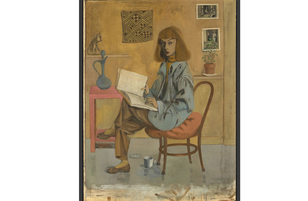
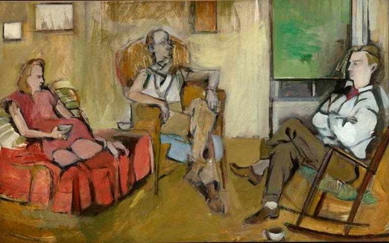
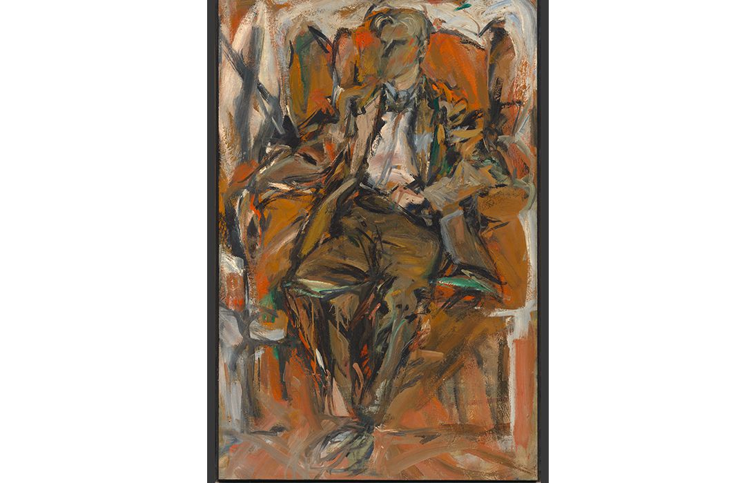
It also arrives in wholly unexpected ways, which was the case when happening upon a self-portrait (1946) of Abstract Expressionist, Elaine de Kooning.
The tones in the folds of the fabric (her posture both slouchy but alert!), the ochre plaster backdrop, the rich chocolate lines of the Bentwood chair, and the pop of pink juxtaposing it all………well it simply stopped us in our tracks. The complete color study in one composition has us thinking about these right-now tones and is now pinned to our studio wall.
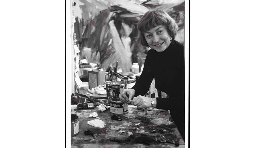
Perhaps the greater gift of stumbling upon something so moving is learning about this free-thinker, a gifted figurative painter and respected critic who happend to marry the leading Abstract Expressionist of the 20th century, Willem de Kooning, which surely overshadowed focus on her own talents. In 2015, two and a half decades after her passing, an exhibition at the National Portrait Gallery in Washington D.C became the first major exhibition in 20 years devoted to her portraits, focusing on the way she reimagined the modern portrait using figuration with the vocabulary of her more Abstract Expressionist vernacular.

How these ideas and inspirations apply to the way yarn colors interact on the loom, with each other and the interplay of tone and texture, shade and light, well that’s on us to figure out. But it’s sure fun to share.
What’s your color inspiration?